Metro Detroit's Segregation On Display In 'Racial Dot Map'
By Dan Jenkins
@DanTJenkins
Residents of metro Detroit know that Eight Mile Road is one of the area's most prominent dividing lines -- it's where the suburbs end and the city begins.
Now, a new demographic study has shown just how divided parts of the Detroit area really are.
The map below shows the race of metro Detroit's residents. The data was taken from the 2010 Census and compiled by University of Virgina's Dustin Cable, a former demographic researcher.
Each dot on the map is color-coded by race and ethnicity -- Whites are coded as blue, African-Americans as green, Asians as red, Hispanics as orange and all other racial categories are coded as brown.
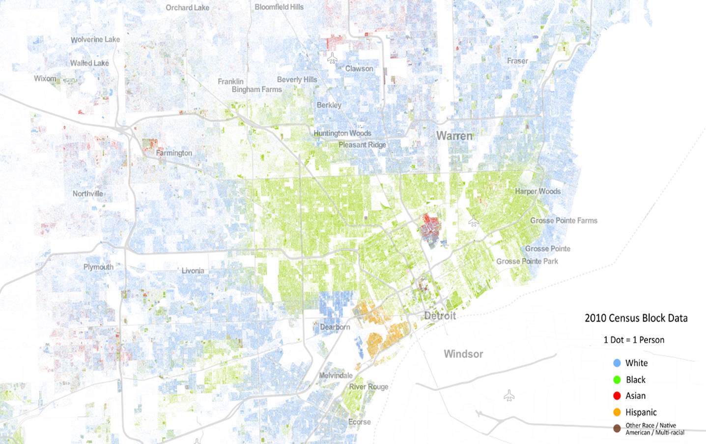
The most obvious observation is the density of African-Americans residing within Detroit and how starkly the demographics change along the city's borders -- most notably Eight Mile and the eastern borders to the Grosse Pointe area.
Also seen is a large population of Hispanic residents in southwest Detroit's Mexicantown.
The map is part of a much larger study which places a dot for each person in the United States over a map of the country to show how races are segregated and integrated throughout the nation.
"The map displays 308,745,538 dots, one for each person residing in the United States at the location they were counted during the 2010 Census," the study explained.
You can see the full map of Metro Detroit and the entire United States HERE.