5 Pro Sports Teams That Desperately Need A Rebrand
By Dan Jenkins
@DanTJenkins
Everyone loves their team colors!
OK, most people love their team colors because there's some teams whose image is in dire need of a refresh.
Some teams get it right. Every year, a number of franchises across the NBA, NHL, MLB and NFL change their look -- usually one or two in each league -- whether it's to something completely new or an awesome throwback.
This year, the Sacramento Kings and the Toronto Maple Leafs and the Pittsburgh Penguins opted to pay homage to their roots and came up with retro designs that still look great in the 21st Century.
(Though we don't like the Penguins here in Detroit, lets give them credit for ditching the tan (more on that later) and going back to a bright yellow.)
Despite that constant state of change in professional sports, there's still some franchises that need a major makeover. Here's five that should go back to the drawing board immediately:
Los Angeles Clippers
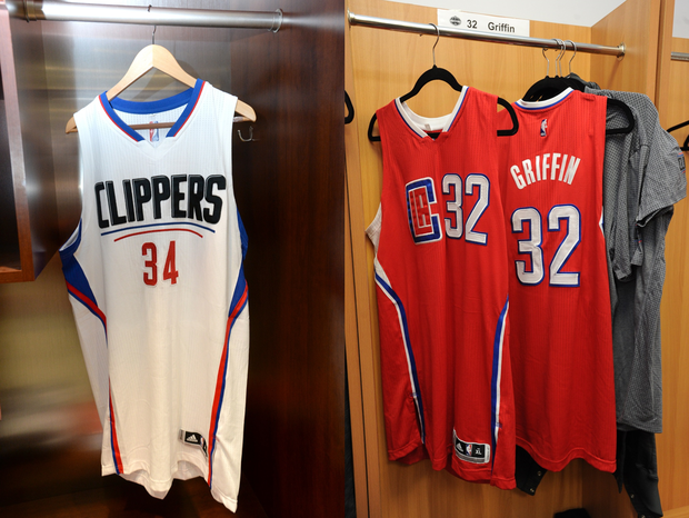
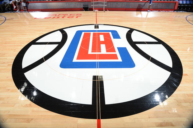
The Clippers just changed their look a couple of seasons ago and many people wish they didn't.
Sure, the team was trying to get out of the shadow of former owner Donald Sterling by completely rebranding itself, but this was the best they came up with?
This was supposed to look clean and modern, but it just didn't work. The road jerseys are too simple and the logos and fonts look like they were made in Microsoft Paint (I'm looking at you, Steve Ballmer).
Orlando Magic
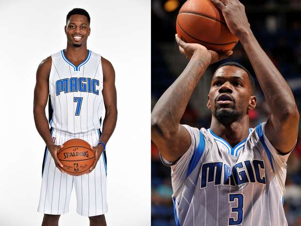
The Magic look like they don't know what decade they want to play in.
The logo looks old and outdated, as it isn't too much of a change from their 90s logo, but the font looks nice and updated.
Now lets look at those jerseys. Pinstripes belong in baseball, end of story. As for the grey, sleeved jerseys -- they look like pajamas (insert joke about the 35-win Magic sleeping on the court HERE ___).
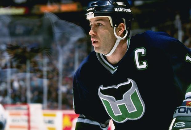
Arizona Coyotes
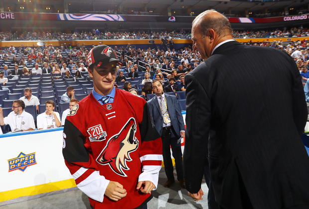
The Coyotes went through a mini rebrand a couple of seasons ago, no longer representing just Phoenix but all of Arizona.
The team had a crazy looking animal as its logo when it was created in the 90s and updated in 2003, but has been running with that wolf head on the front of its jerseys ever since.
Many think that the team will ultimately move to another city, citing all of the problems with its ownership. Wouldn't it be nice to see this design in the league again:

What about this one?
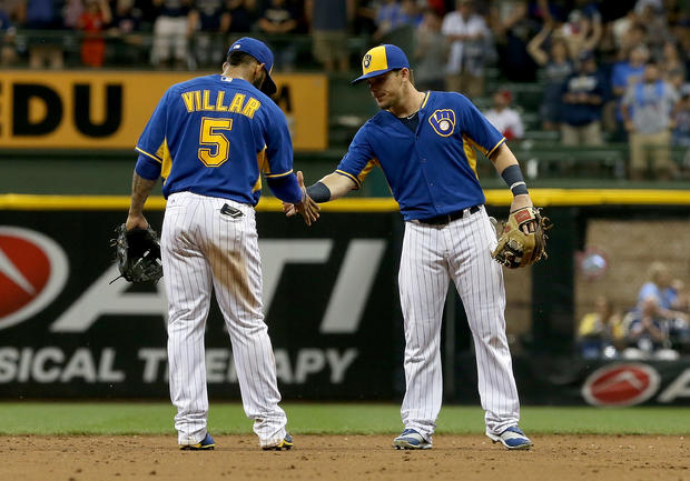
Milwaukee Brewers
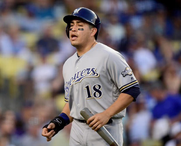
Teams are starting to figure out that tan (or gold as they try to call it) should not be used in the color scheme of any professional sports team.
The Penguins fixed it this past postseason, wearing their throwback yellow and black sweaters en route to a Stanley Cup title. Also, the now-Los Angeles Rams have talked about rebranding to the old yellow and blue scheme that the original franchise had.
Get on-board, Brewers. They showed us just how good their uniforms could be on Friday (and that logo is one of the best that isn't being used!).
Miami Marlins
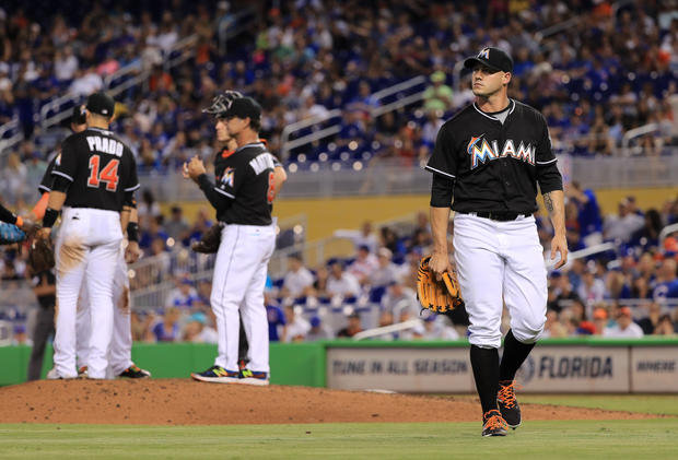
The Marlins tried to do too much here. It looks like a box of multi-colored highlighters threw up on a jersey. The modern look of the font and tiny swooshing fish logo are just fine, but there's just so many colors.
It would be fine if it all worked well together, but it doesn't.
The old Florida Marlins look was better, but not too much better.
What do you think: Agree? Disagree? Let us know which teams you think should be looking for a new look in the comment section below.