Five Worst Uniforms In Sports Today
By Dan Jenkins
@DanTJenkins
While watching pretty much any sporting event, I often find myself thinking, "what in the world are they wearing?" or "who thought that would look good?"
The state of uniform design is pretty good nowadays, with quite a few franchises undergoing rebrandings to a more modern look. Unfortunately, some teams get it dead wrong.
Here's a list of some of the worst sports uniforms that are out there today.
Luckily, no Detroit teams made this list. Even ESPN thinks that the Motor City has some pretty good uniforms.
5. Colorado Rockies
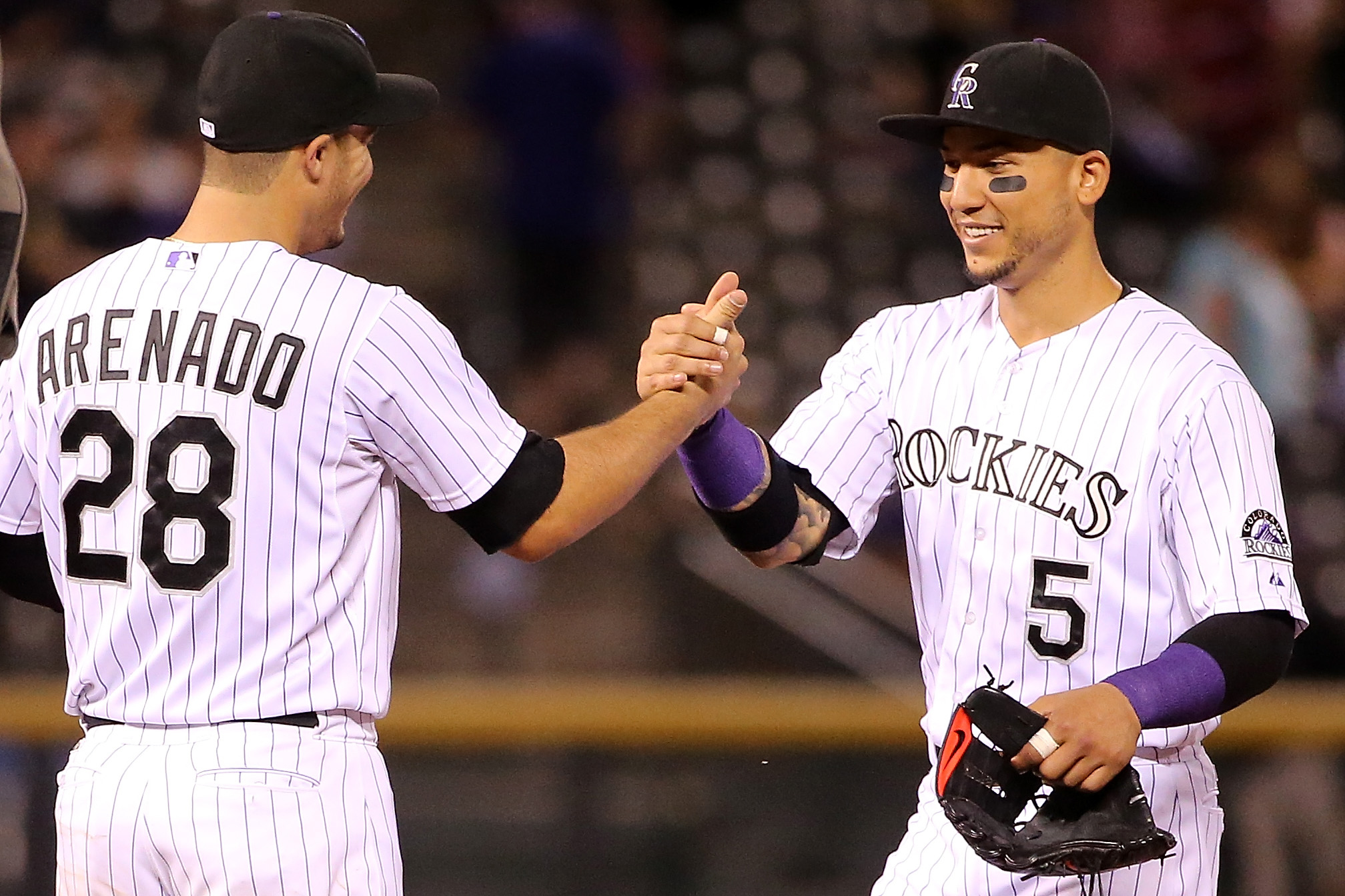
The Colorado Rockies make this list for their home uniforms, which are just too boring. Since joining the National League in 1993, the Rockies haven't changed their look much.
Plain white with pinstripes underneath a boring "Rockies" script isn't the worst thing out there, but they could certainly do better, considering how good their purple alternate jerseys are.
4. Jacksonville Jaguars
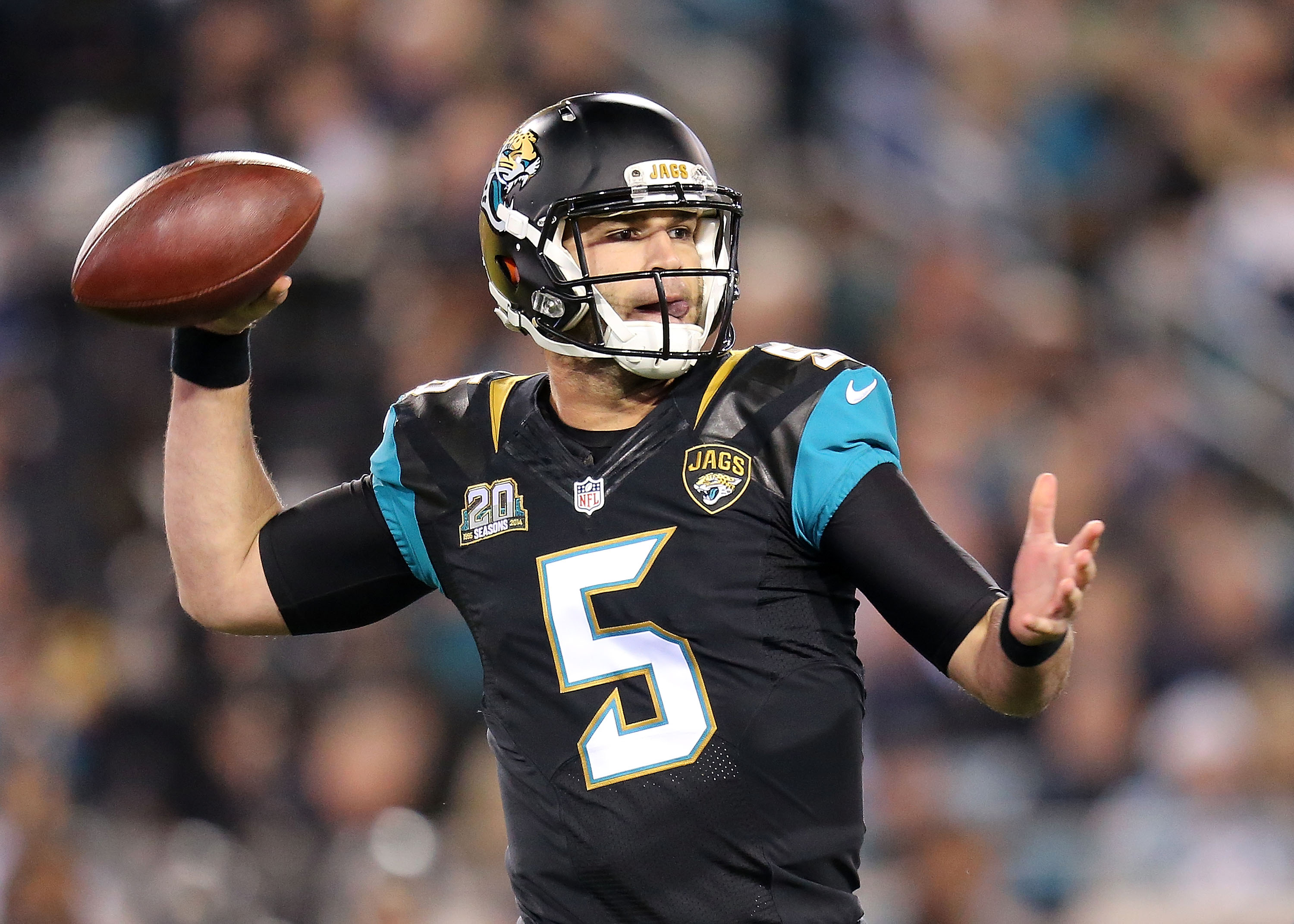
The Jacksonville Jaguars underwent a rebranding in 2013 which introduced new logos, uniforms and helmets. The new look was met with much disgust from fans around the league.
The real killer is the two-tone helmet. They had something going with the flat black, but ruined it with a gold gradient. Not to mention how dated the teal color on the sleeves of the jerseys is.
3. Los Angeles Clippers
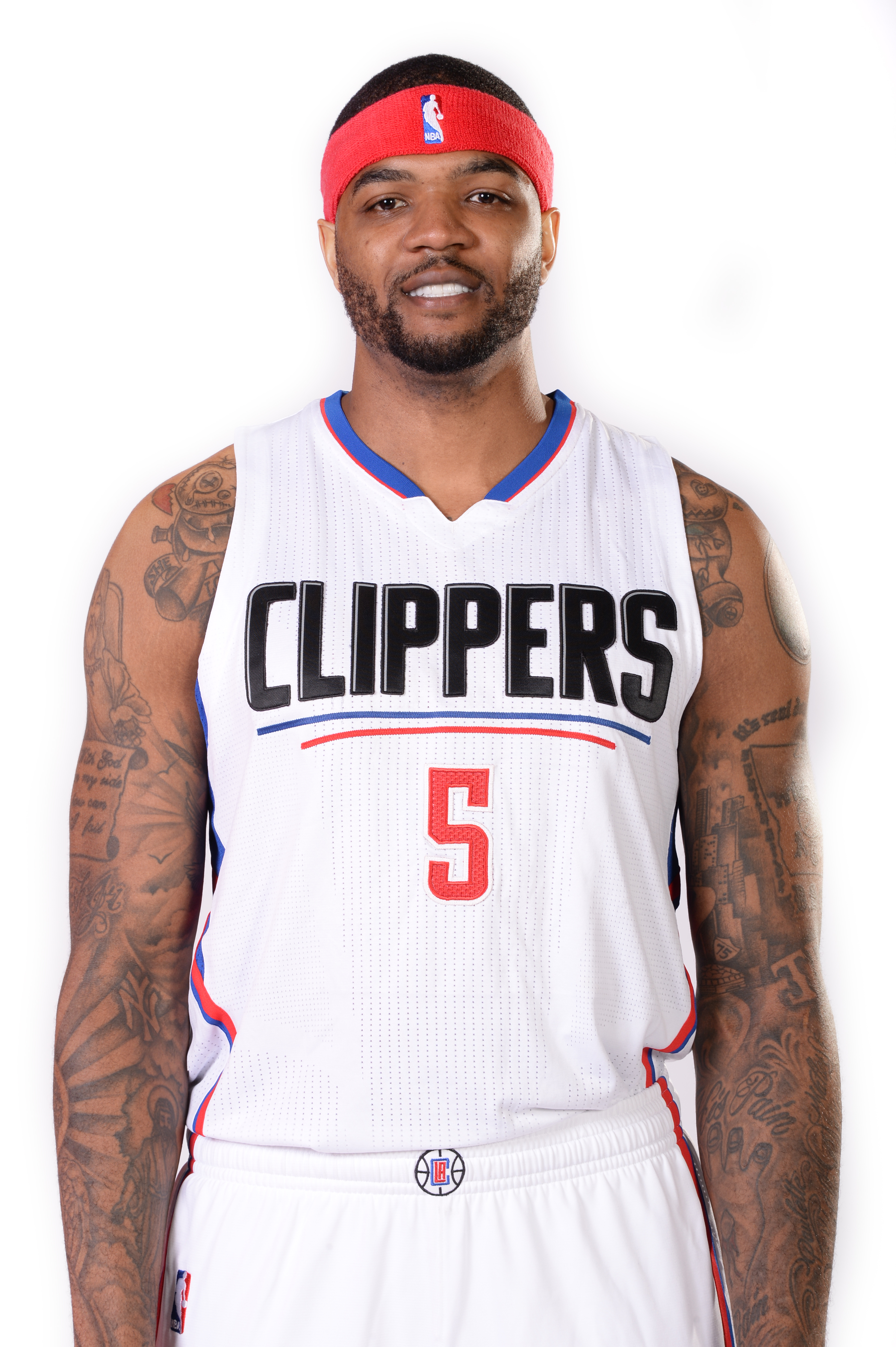
The new Los Angeles Clippers jerseys and logos look like they've been designed with WordArt in Microsoft Paint -- fitting because former Microsoft CEO Steve Ballmer recently bought the team.
There's a difference between wanting a modern, clean look and a look that's just too simplistic -- that's what the Clippers got with this jersey. The only thing worse is their new road uniforms...
2. Atlanta Hawks
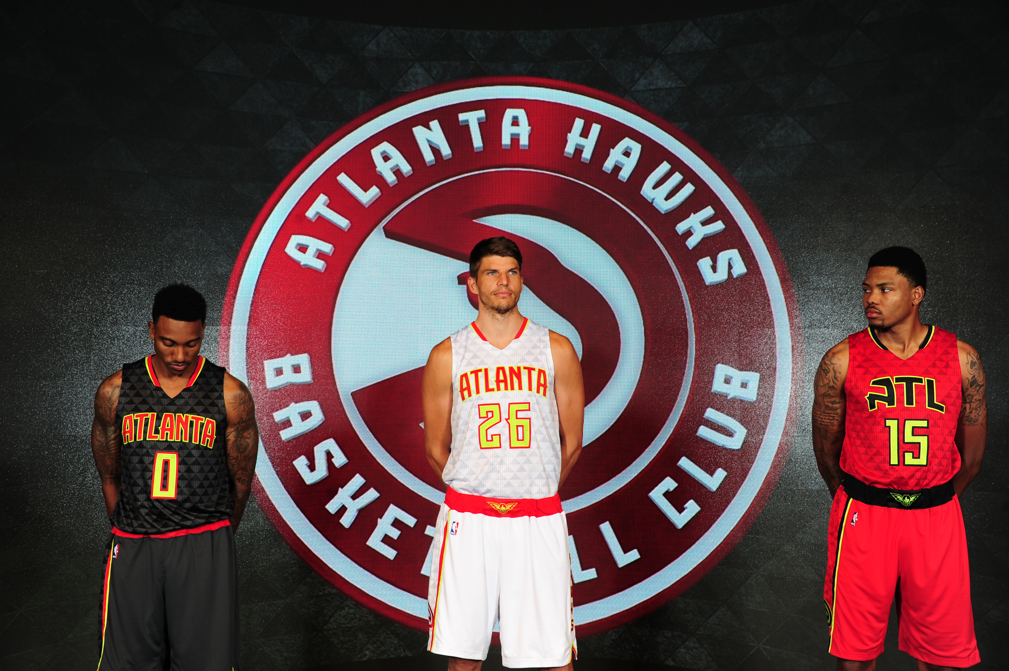
The Atlanta Hawks really blew this one. The franchise had some of the best jerseys in the NBA for the past couple of seasons and threw it all away.
The Hawks jumped on the Oregon Ducks bandwagon of using highlighter yellow/green color -- which I personally find appalling -- that has nothing whatsoever to do with their color scheme. To make things worse, they added a weird pattern of triangles to each jersey for some reason.
1. Tampa Bay Buccaneers
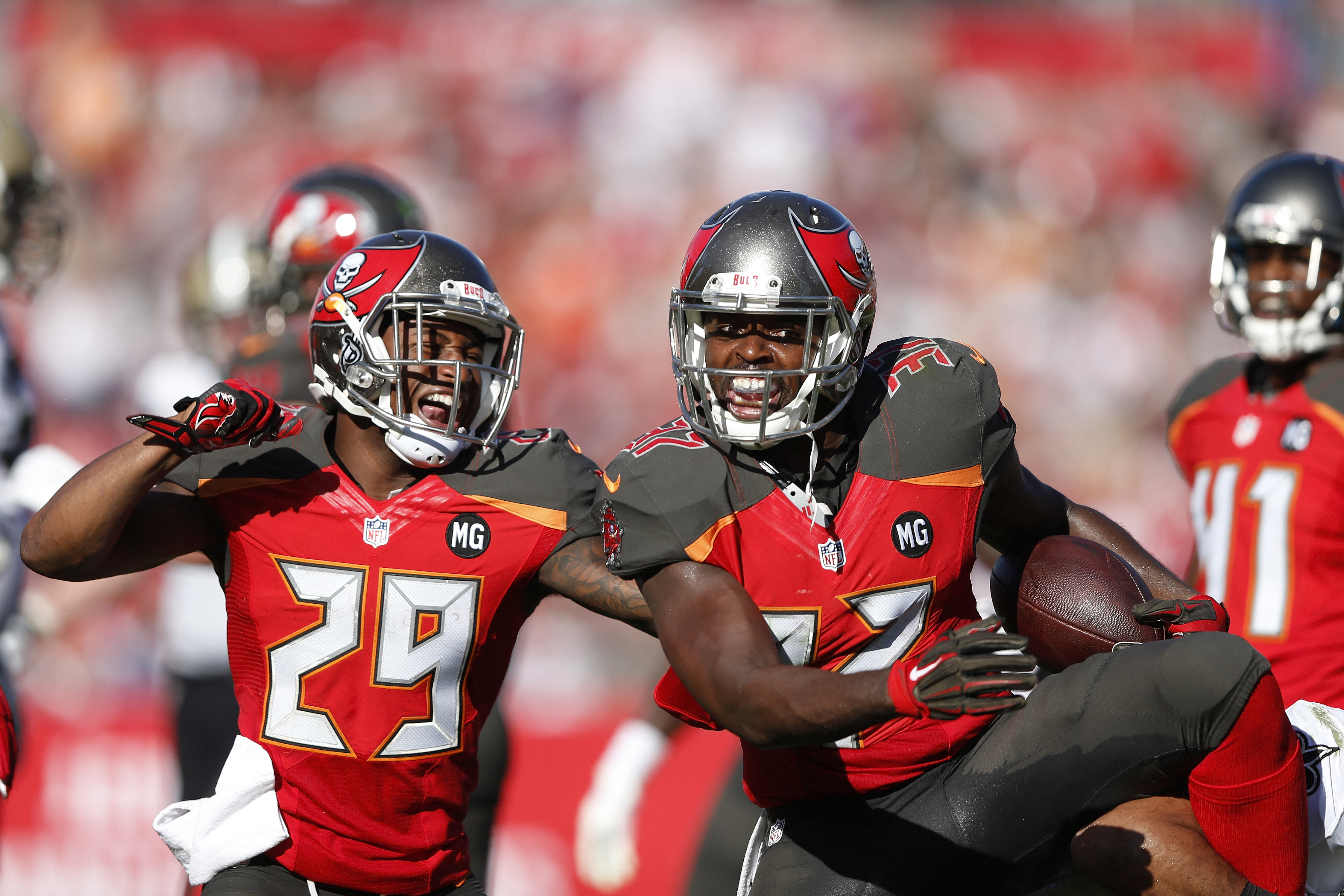
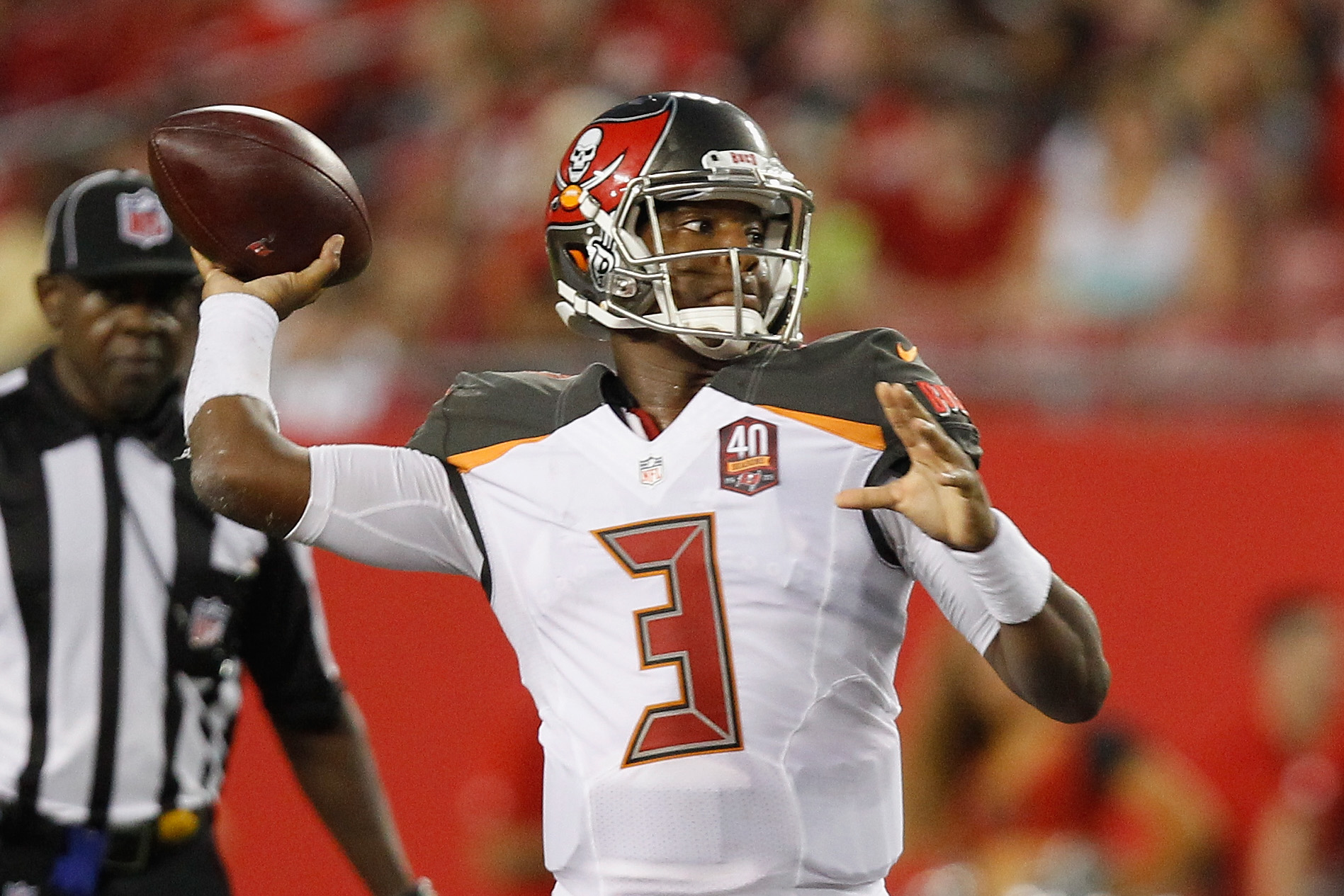
These uniforms worn by the Tampa Bay Buccaneers are almost good. They are ruined, however, by the giant digital clock font used for the jersey numbers.
The Bucs have always had a strange color scheme of burgundy, orange and gray, which they just can't seem to figure out how to make look good.
What do you think? Which uniforms would you add or take off of this list. Vote in our poll and let us know in the comment section below.